 Do you marvel at the glossy pages of interior design magazines and wonder how people seem to have impeccable interior design style and taste?
Try as hard as you might, you look at your own living room, dining room, study and bedroom and find that somehow, they lack a ‘certain something’. Is this ‘certain something’ the best-kept secret in interior design, you may ask? What is it that stops your interior design style looking individual and yet cohesive?
Take a look at some of these insider tips and enhance your interior design style (and better still, they come in under budget too!).
Work with what you’ve got
It becomes expensive if you are constantly chasing a certain look or style and in an effort to grab it, you are continually buying new furniture and replacing the soft furnishings. With this in mind, the following insider tips are principles that can be applied to the furniture and items you already have in a space.
Two Colours and an Accent
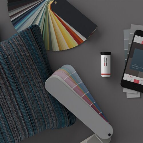
Colour is important in a space. You are naturally drawn to some colours but not to others. Clearly, likes and dislikes when it comes to colour is important. But, in any living room or space, do you stick with the principle of two main colours and a third acting as an accent?
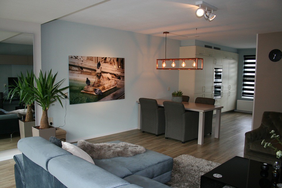
For example, you may opt for a blue colour scheme, using various shades of blue, with a light cream as the second colour (shades and hues are explored in the next principle). But your third accent colour may be a leaf green. You would use this sparingly but with precision and boldness.
For example, you may have a pair of angel chairs in your third chosen accent colour. Or you may choose to stick with a third accent colour with a statement piece, such as central hanging light.
Too many colours clutter the eye as a result of a lack of cohesiveness in the colour scheme.
Takeaway point
- Use the third accent colour decisively; in other words, don’t just stick to cushions and curtains, opt for an item of furniture in an accent colour.
The Ombre Effect
For a few years, this was the must-have colouring effect for hair. It was a colour with a graduating effect from dark to light or vice versa. It was a clever technique that gave some stunning results.
Although not quite the same thing, the principle is similar when it comes to colour, shades and hues in a space.
If you really study the glossy pictures on photo-rich social media sites and interior design magazines, you will notice several key things. The first are the colours used in the scheme and how they are paired together and how a colour is used to make something stand out (or not, as the case may be).
But once you notice the colour scheme, look at where the shades differ. And you will see an ombre type effect.
Darker colours and shades are the base of the room, usually the floor and rugs. There are slightly lighter shades on the wall and the ceiling is usually a neutral shade or colour, such as white.
Using colour in this way gives the room cohesions and a sense of order that the eye can follow. Is this the case in your rooms, or is there some confusion?
Takeaway point
- Some interior designers say that in every room, as well as two colours and an accent colour, you should also include a small amount of black to help frame the setting
Connection and Framing
And finally, we look at the principles of framing furniture. In a living room, there is a sofa, maybe an armchair and a coffee table. How are these things connected?
Think in ‘threes’ – for example, an armchair, a side table and a rug. These three things when ‘grouped’ informally together will look connected. The side table is not bigger than the chair so that the armchair is the star of the show and the rug pulls it altogether by being the platform on which both items sit.
Takeaway points
- Does your coffee table frame the sofa? If it is too big, it swamps it but too small and the sofa will appear gargantuan.
- Consider the size of any rugs in the room – are they adding something to the overall cohesion or detracting from it? Remove the rug, and you will see the answer.
Furniture enhances your interior design style providing you understand the impact of colour and cohesion on a space. What will you change?
Sloane & Sons understand the impact of furniture on any space which is why they have only the very best and the most stylish chairs of all shapes, size and designs for their customers.
Written in collaboration with Sloane & Sons
© Copyright 2017 Antonia, All rights Reserved. Written For: Tidylife


Thanks for the great tips, I especially like the ombre effect and I’m keen to try that. Now that you’ve pointed it out I’m going to start spotting it everywhere in photos!
I like your point about having two colours and a third accent colour. I sometimes think you need to be bold when it comes to finding that ‘certain something’ in a room, and having an accent chair in a different colour certainly makes sense to me. Great article.